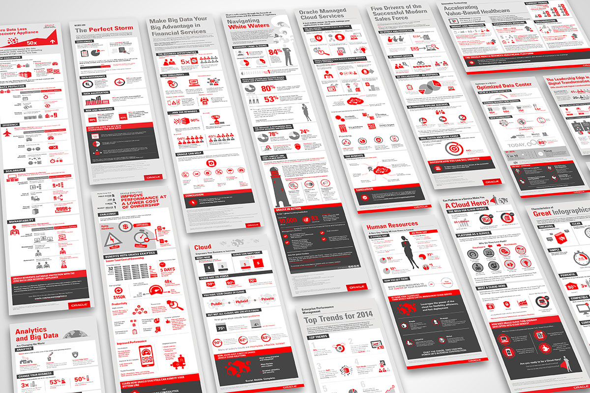
In 2017, Oracle's most popular publicly available content type was the infographic. As a highly technical company with a strong database community, Oracle would have vast amounts of written content online that needed to be presented in a more digestible format for its users.
There was no templated fixed design, but we worked out the main components to meet reader's needs for each infographic. The result presented solid creative design that supported the correct messaging.
The brief was to create a set of infographics that could be used online and for print. The challenge was to produce easily digestible content whilst maintaining readability. The solution was creating graphics and adding iconography to highlight integral information.
Creating a balance of colour that would translate from digital to offline was key whilst following brand guidelines. The graphics evolved to produce animated gifs for social media.
Working closely with content creators to ensure the design pulled out key components. In order to enhance the typographic layout, we added iconography to engage readers with the content.